Figures & presentations
How to make a good figure and how to give a talk
Learning objectives
After this lecture you can
- apply the eleven rules for better figures to your own plots
- spot misleading axes, bad colour maps, and chartjunk – and fix them
- structure a short scientific talk around a simple story
- prepare the final colloquium presentation (including the scaling plot)
Why figures matter
Of the people who decide they like the title of your paper:
| Share | … will |
|---|---|
| 1% | actually read the paper |
| 5% | read the abstract |
| 10% | read the figure captions |
| 100% | look at the figures |
Your story should be in the figures.
Eleven rules for better figures
Condensed from Rougier, Droettboom, Bourne, Ten simple rules for better figures, PLOS Comput. Biol. 10, e1003833 (2014). They are mandatory for the final colloquium.
Rule 1 – Read the labels
Every axis has a label; every label is legible at the back of the lecture hall.
If the reader has to squint, the figure is broken.
Rule 2 – Number panels, top-left
Multi-panel figures get (a), (b), (c) … in the top left of each panel.
Caption and talk refer to panels by letter – don’t make the reader hunt.
Rule 3 – Use space wisely
No wasted white space, oversized markers, or decoration – and no four ideas crammed into one figure.
Give the important content the space it deserves.
Rule 4 – Use identical scales
Panels meant to be compared get the same axis ranges and tick spacing.
Different scales hide the very effect you want to show.
Rule 5 – Points are data, lines are interpolation
Points = measurements; lines = a model, a fit, or linear interpolation.
Don’t draw a smooth curve through measurements unless it is a fit you can defend.
Rule 6 – Captions trump legends
The caption explains the figure; the legend only identifies the curves.
A skimming reader must understand the figure from the caption alone.
Rule 7 – Don’t mislead the reader
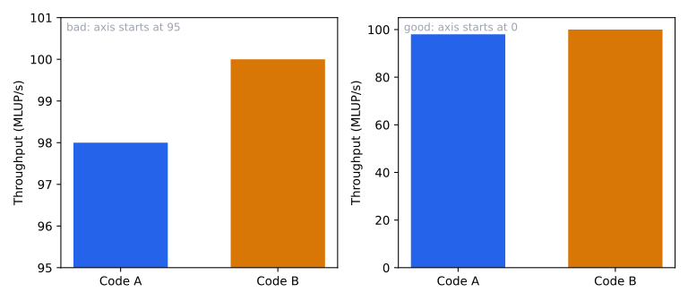
Same data – the truncated axis turns a 2% difference into a dramatic visual gap.
Rule 8 – Don’t trust the defaults
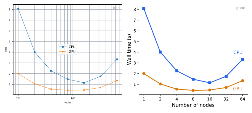
Same data – fix fonts, line widths, ticks, and label curves directly.
Rule 9 – Think about colour maps
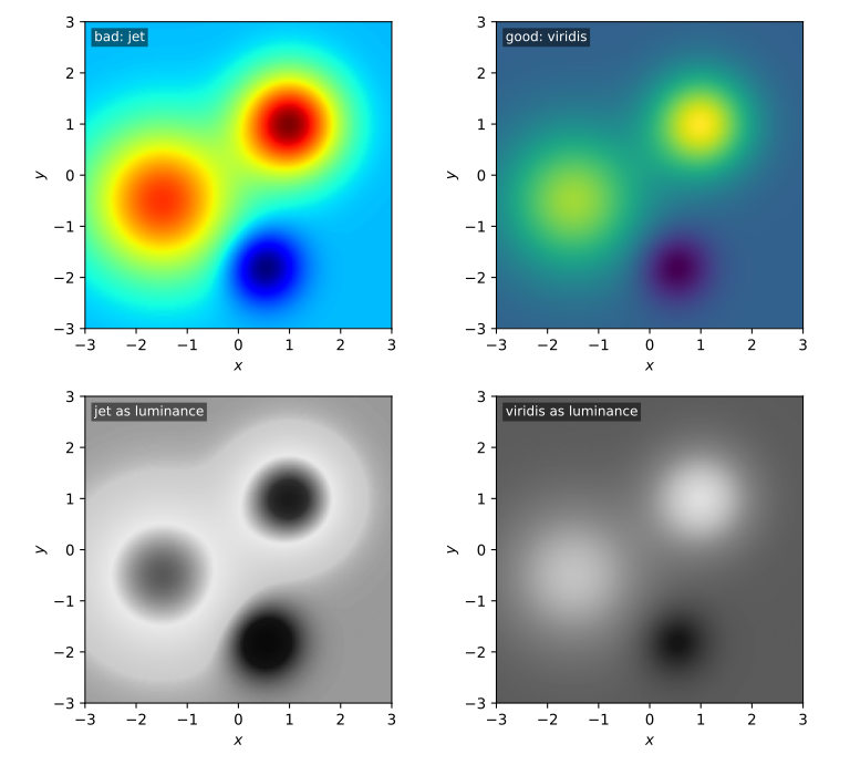
Jet is not perceptually uniform and dies in greyscale – use viridis/cividis (or a diverging map around a meaningful zero).
Rule 10 – Avoid chartjunk
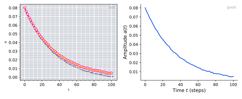
Backgrounds, heavy grids, shadows, legend frames: ink without information.
Rule 11 – Adapt the figure to the audience
A paper figure is dense; a slide figure is sparse.
Re-make figures for talks: bigger fonts, fewer curves, larger markers.
Message trumps beauty
A polished but unclear figure is worse than a rough but clear one.
Decide on the message first; let the visual decisions follow.
Units convention
Specific units in parentheses, ideally with the quantity name:
- ✓
σ (GPa)/ ✓Shear stress σ (GPa) - (ok)
σ / GPa,σ in GPa(DIN style) - ✗
σ [GPa]– never
How to give a talk
There is only one rule
Tell a (simple) story.
This means you have to know what your story is before you start making slides.
Corollary: anything that does not help the story has to be cut – less is more. Slides need to flow logically.
One message per slide
Your story flows through the slide messages. A message is a sentence, e.g. “Kokkos is slower than CUDA”.
- One message per slide
- Support that message with one (at most two) display items
- Support that display item with conclusive, logical data
As little text as possible
While someone reads your slide, they are not listening to you.
- Use bullet phrases, not paragraphs
- Minimum 18 pt for body text, 14 pt for references
- If you find yourself writing full sentences, you’ve gone too far
Preparation
Practice
- Often – you will be nervous
- More often – if you are presenting in a group
Learn by heart
- The first three sentences (so you can start under stress)
- Not the rest – it should sound like a conversation, not a recital
Polish your slides
- Nice figures, consistent fonts, no overlapping logos / text
Dos
- Face the audience – don’t read the slide off the screen
- Explain your graphs one element at a time: “The x-axis shows … the y-axis shows … this curve is …”
- Acknowledge external sources – citation on the same slide as the figure, not on a separate references slide
Don’ts
- Don’t run over time. Minimum: one minute per slide.
- Don’t excuse yourself (“This is the first time I am giving this talk, it will be terrible.”)
- Don’t lie – stretching data to fit the hypothesis is a bigger sin than getting a null result
- Don’t waste a slide on an outline / table of contents – the audience will have forgotten in 30 seconds
- Don’t put all references on one slide at the end – references belong next to the figure or claim they support
Final colloquium
Structure of the talk
| Section | Content |
|---|---|
| Introduction | What did you do? Which programming model? |
| Methods | How does your model work? How does it differ from what we did in the lecture? Advantages and pitfalls. |
| Results | Show the code works (a video of the lid-driven cavity is great). Performance: in million lattice updates per second. |
| Discussion | What did you learn? What would you do differently next time? |
10–15 minutes talk + 15–20 minutes discussion. All group members present.
What a scaling plot should look like
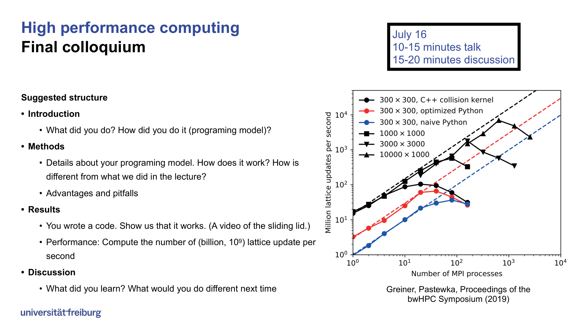
Figure 1: Strong / weak scaling plot from Greiner & Pastewka, Proceedings of the bwHPC Symposium (2019). The \(x\)-axis is number of MPI processes; the \(y\)-axis is million lattice updates per second; the dashed lines indicate ideal scaling.
Summary
The three rules people break most:
- Truncated axes that inflate small effects (Rule 7) – start bars at zero
- Jet/rainbow colour maps (Rule 9) – use viridis or a diverging map
- Default styling and chartjunk (Rules 8, 10) – tweak fonts, strip decoration
And for the talk: one simple story, one message per slide, as little text as possible.
Tools
Figures (free): Jupyter Lab, matplotlib, Inkscape, Gimp, IPE, Blender, ColorBrewer
Figures (commercial): Origin, DataGraph, Adobe Illustrator
Slides (open source): LibreOffice Impress, Quarto, Beamer (LaTeX), Jupyter + RISE, Marimo
Slides (commercial/free): PowerPoint, Keynote, SoftMaker Office, OnlyOffice, WPS Office
Further reading
- Rougier, Droettboom, Bourne, Ten simple rules for better figures, PLOS Comput. Biol. 10, e1003833 (2014) – https://doi.org/10.1371/journal.pcbi.1003833
- Bourne, Ten simple rules for making good oral presentations, PLOS Comput. Biol. 3, e77 (2007) – https://doi.org/10.1371/journal.pcbi.0030077
- Fleming, How to give a great scientific talk, Nature 564, S84–S85 (2018) – https://doi.org/10.1038/d41586-018-07780-5
Reading
HPC: Parallelization on GPUs and Accelerators